Featured Characteristics

– The LexisNexis logo has been reformatted to a stacked version with an updated logotype and enclosed in a tag shape.
B COLOR– Capitalize on the recognizable LexisNexis color palette.
C TYPOGRAPHY– Strong headlines, set in the Lato typeface, are designed to grab attention and are a main element of this campaign.
– The Big Red nickname comes from the use of large photography overlaid with red.
E ESSENTIALS & ICONS– The Essentials call out product differentiators through type and icon design.
Refreshed Logo
A NEW LOOK
The LexisNexis logo has been updated with an easier-to-read logotype and a streamlined Knowledge Burst logo. This tag logo is introduced for the Big Red Campaign only and is not meant to replace the existing LexisNexis corporate mark on communications created outside this campaign.
The refreshed logo options should be used in all new communications to begin building consistency and brand awareness.
Tag Logo
The main logo of the new campaign is the red tag stacked version. This should be used as the prime identity mark and is replaced only when absolutely necessary.
Color Variations
Color variations are available but should be used only when the red tag version has issues with legibility. Black and white options should be used only for black and white communications.

Horizontal Logo
This version of the logo is used when the tag logo does not work due to size constraints. It can also be used on two sided pieces when the tag is already present on one side.

One-Color Variations
Variations are available only when the full-color version has issues with legibility. For one-color communications use the all-black logo. In situations where the logo is reversed out of a color, use the white outlined Knowledge Burst option.
Tag Logo Rules
SIZE & SPACE
Treating the logo with consistency is important. This attention to detail reinforces the LexisNexis approach to business and identity. The tag logo is the primary mark for this campaign and is always used with the Knowledge Burst logo and type together.
Logo Size
In order to maintain logo consistency, the rectangle holding shape will be 1" wide for all standard sized pieces.*
*The logo may be scaled proportionately for specialty pieces; Web banners and pages or large format designs.
*The logo should be no smaller than 11% of the final area size.
Area of Isolation
The integrity of the logo requires a clear area; no text should crowd, overlap or merge within .125" of the mark.
Placement
The tag logo is always placed on the left edge of the document. A .75" margin is preferable where space allows on standard-sized communications. The logo always aligns with the top of the page.
Incorrect Logo Usage
DON’T DO THIS
Do not remove any pieces of the logo, exceptions may be made for web.
Do not increase size for most digital and print pieces. Exceptions are made for large-scale pieces such as trade show displays and large banners or signage.
Do not change the tag to an unapproved color.
Do not change the type style or size of the Knowledge Burst logo.
Do not fill the tag with photos or patterns.
Horizontal Logo Rules
SIZE & SPACE
Treating the logo with consistency is important. This attention to detail defines the LexisNexis approach to business and identity. The horizontal logo is used when the tag logo is already present for a two-sided piece or when space is limited due to tag logo guidelines and a horizontal solution is necessary.

Minimum Size
For legibility reasons, the horizontal logo should never be scaled below 1.5" wide.

Area of Isolation
The integrity of the logo requires a clear area; no text or image should crowd, overlap or merge with the mark. Use the Knowledge Burst logo as the safe area measurement.

Lato with Knowledge Burst Logo
Do not use the Lato font with the Knowledge Burst logo for this campaign, except in the tag option.

Corporate Signature Logo
Do not use the Corporate Signature logo for this campaign.
Color
BIG RED & A LITTLE GRAY
This Campaign capitalizes on the easily recognizable LexisNexis PMS 185 Red. Secondary colors have been introduced to complement the Red theme. Nearly all text is set in 85% Black; when necessary PMS Cool Gray (and its tints) can be used.


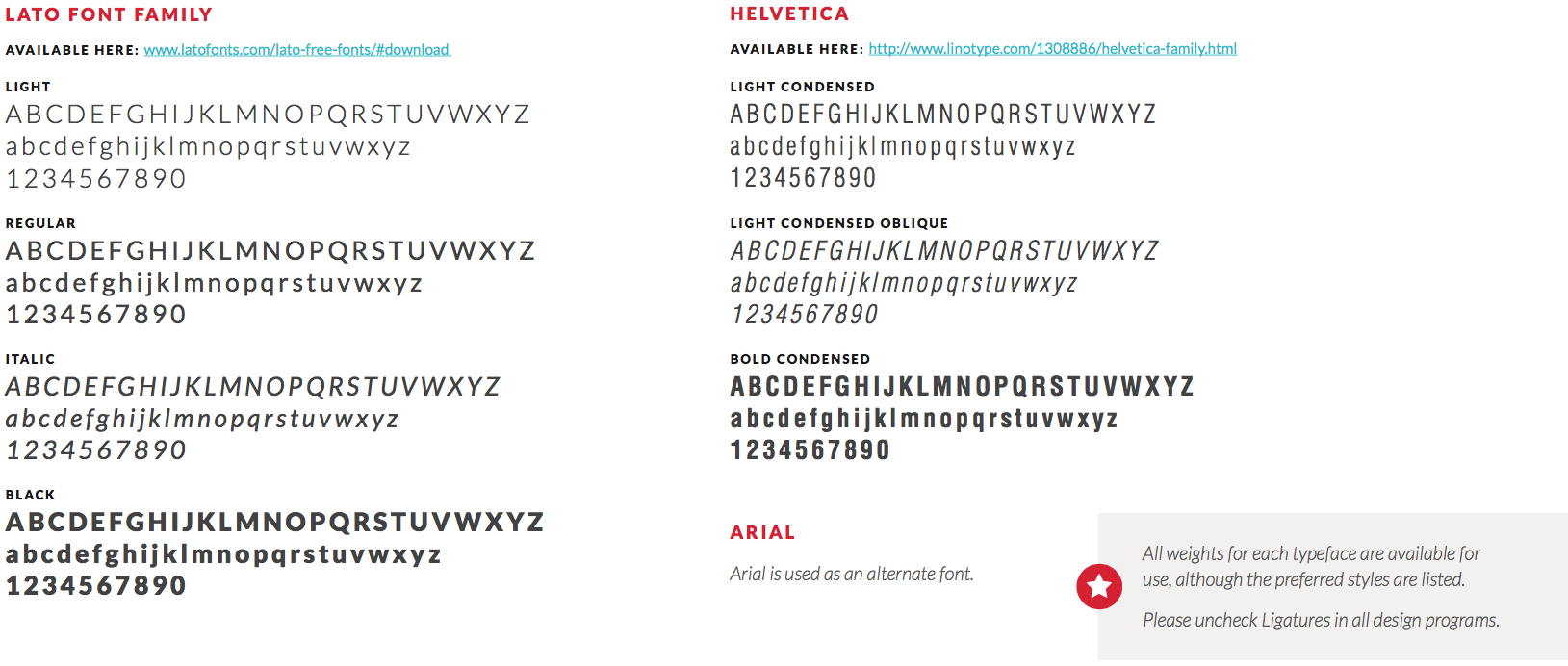
Typography
FONT FAMILIES
This campaign relies on Lato (OpenType) as the exclusive font for the majority of communications. Lato is a versatile typeface that is easy to read in body copy while also commanding attention when used in Black, all caps for headlines. Nearly all text is set in 85% Black. Helvetica is used for legal copy, infographics, subheads and chart design.
Headlines
TYPE HERO
A key feature of this campaign is the attention-grabbing typographic headline hero. These headlines are created with Lato Black. Headlines are sized according to the publication they are used in and vary in size to gain the most impact. Text is justified with secondary messaging running underneath if necessary. Headlines should have a .125” space between lines. See publication sections for examples.
HEADLINE STYLES:

Introduction
Recommended for use when launching a new product or feature

Claim
Recommended for any execution; claims may be quantitative or qualitative

Narrative
Recommended for highlighting a specific use-case or feature
Photography
BACKGROUNDS & IMAGERY
Photography is an important element of the campaign. Large background photos help to illustrate powerful headlines that are the focus of our communications. All photos should be selected carefully to creatively enhance the text. Lifestyle shots are not recommended. Once the photos are chosen, a red overlay is applied.

Full Red
For most print and digital executions, a full photo with the red overlay is used.

Half Red
When necessary, the red overlay can cover just half the photo.
Rules for the Red
CREATING THE OVERLAY
When building the red overlay effect for photography, please use these guidelines. Use the overlay to fully cover an image or as a half split where the red is on the left side. The red color is created using these values: CMYK 0 100 100 0. Discretion should be used when creating each piece. The overlay should never appear on the right side only.
Full Red
Change photo to grayscale or manipulate the saturation in Adobe® Photoshop®. Apply two red (CMYK 0 100 100 0) shapes to overlay the photo. One shape is 100% multiply, second shape is 70% opacity. Darken top left corner if necessary to help the tag logo stand out.
Half Red
Red overlay always appears on the left when used with a full-color image. Photo may need to be darkened to allow for text legibility. Create two red (CMYK 0 100 100 0) shapes to overlay the photo. One shape is 100% multiply, second shape is 70% opacity.
Incorrect Photo Usage
DON’T DO THIS

Do not zoom in or use close crops of people. Avoid lifestyle and staged imagery.

Do not use silhouetted people similar to the previous campaign.

Do not use illustrations as background imagery.

Do not change the overlay color.
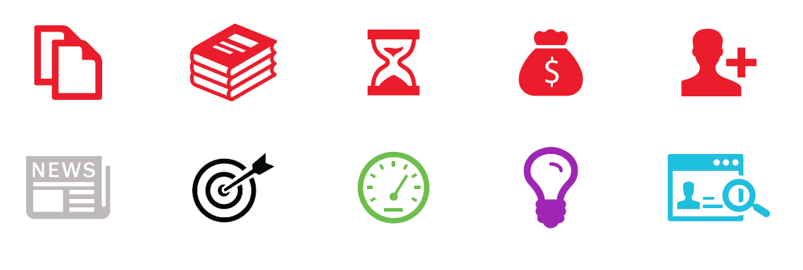
Essentials
ICONS & TYPE
A unique feature of this campaign is the addition of the Essentials. These illustrative icons work as a system to advertise key facts and competitive differences about the products in a simple and direct way. This allows more freedom for the headline messaging to creatively convey benefits that can resonate on an emotional level. The Essentials include quantitative differentiators as well as specific product information.

A QUANTITY
–Essentials should be used in groups of four—a group of three may be used when required by space constraints or if product differentiators are limited
–Never use fewer than three
B ORDER
–For best results, alternate between icon and numeral treatments
C SPACE
–There should be 3.5" between the first and last circles
D PLACEMENT
–Essentials appear at the bottom right of print pieces
–Align the circle of the first essential to the center measurement of the document
–Visually align second and third Essentials between the first and last circle
E MARGINS
–Keep margins even on right and left sides
–Align Essentials vertically in the white space at the bottom of the page; When legal copy is present, center between legal and bottom of image
Essentials Design

CREATING NEW ESSENTIALS
A CIRCLE
–Circle size is .425"
–Circle color is PMS 185
B ICON DESIGN
–Most icons are available through the Essentials database; new icons may be designed as needed, but should be vetted through product marketing
–To create text-based icons, use Lato Black, 11.5 pt., and Lato Light,
11.5 pt. centered within the circle
–To create icon shadow, use these steps in Adobe® Illustrator®:
- Change text to outlines, copy icon and text.
- Go to Effect>Distort & Transform>Transform.
- Change the Move Horizontal and Vertical settings to .0001,
set Copies to 150. - Expand shape and then choose Add in the pathfinder palette.
- Change color to a PMS 185 to black gradient, multiply and set the transparency to 20%.
- Paste original icon in place.
C DESCRIPTOR TEXT
–.062" between icon and text
–Text is 85% Black
–Descriptor text is centered in two lines beneath the circle.
FIRST LINE: Lato Black, 6 pt., 7.5 pt. leading, 100 pt. kerning
SECOND LINE: Lato Regular, 6 pt., 7.5 pt. leading, 100 pt. kerning
Incorrect Essentials Usage

DON’T DO THIS
A Do not change the size of the icons within the circles
B Do not change the size of the text within the circles
C Do not change the color of the circle
D Do not change the typeface or type size of any text
E Do not put text on more than two lines or change the order of Bold and Regular text
F Do not change the angle of the drop shadow
G Do not stack or overcrowd type in the circle
H Do not change the color of the icon
I Do not change the location of the type
J Do not use less than three in a row
K Do not move Essentials to another space
Iconography
INFOGRAPHIC ICONS
Illustrations may also be used outside the Essentials as necessary for charts and infographics. These icons can appear in any of the approved color options.
New icons may be created as needed, contact the X-Team for design approval.